


Off-Brand
“Off-Brand” is a collection of work that explores the world of visual communication. By breaking down branding and identity of major brand names, I analyzed what makes a brand. I discovered the relationship between color, shape and typography for each individual piece—erasing some elements, while highlighting others.
"Pixar" is a series of minimalist posters depicting every Pixar film in chronological order. The series is meant to explore the symbolic items and themes of each film, by using icons that are easily recognizable to fans of the movies.
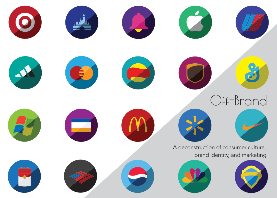
“Rebranding” is a series of graphic design posters that reimagine some of the most popular brand identities. The design reflects a minimalist idea—that even in its boiled down form, major brands resonate with the average consumer. To explore what makes a brand identifiable, I chose to break down each label by color and shape. Even when altering color for more contrast, these products still hold onto their identity.
Using typography for both a large scale poster and four vinyl labels, I created an identity redesign of the popular band “Queen”. Each vinyl record and the large scale poster use text from Queen’s most popular songs.
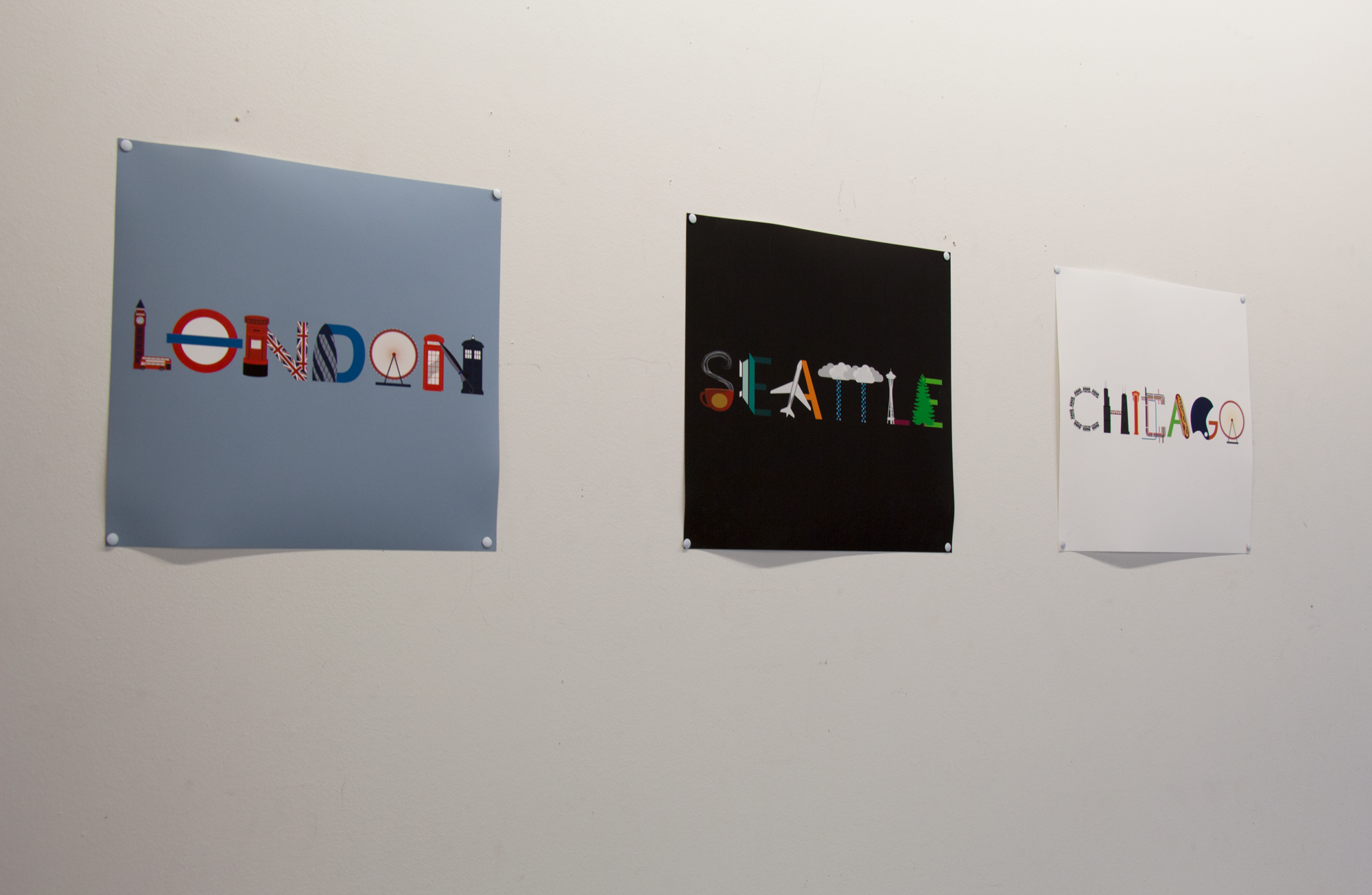
Finally, my series of t-shirts that I have dubbed “City Tees” seek to explore the iconography of a city. Using the city’s own architecture and imagery, I create iconic typography to spell out each city’s name. The series was a pet project of mine that started in my first graphic design class, so besides fitting into my collection, it represents the last five years of work at the University of Iowa.
BFA Showcase Invitations
As part of my BFA showcase, I designed and printed invitations to the event.